YouTube, but in Our Way
Today, we have built something that instantly delighted us:
a Chrome extension that makes YouTube feel completely different.
Not more features.
Just less noise.
Why?
YouTube is fantastic in terms of content. But the interface…
busy, loud, constantly distracting. Shorts that hijack your attention, thumbnails vying for your focus, and little peace to simply watch what you want to watch.
We noticed we were opening YouTube more and more tired.
That felt like a design flaw.
So we thought: what if we treat YouTube the way we approach everything at PB?
Calm, focus, aesthetics. Letting the content speak.
What We Created
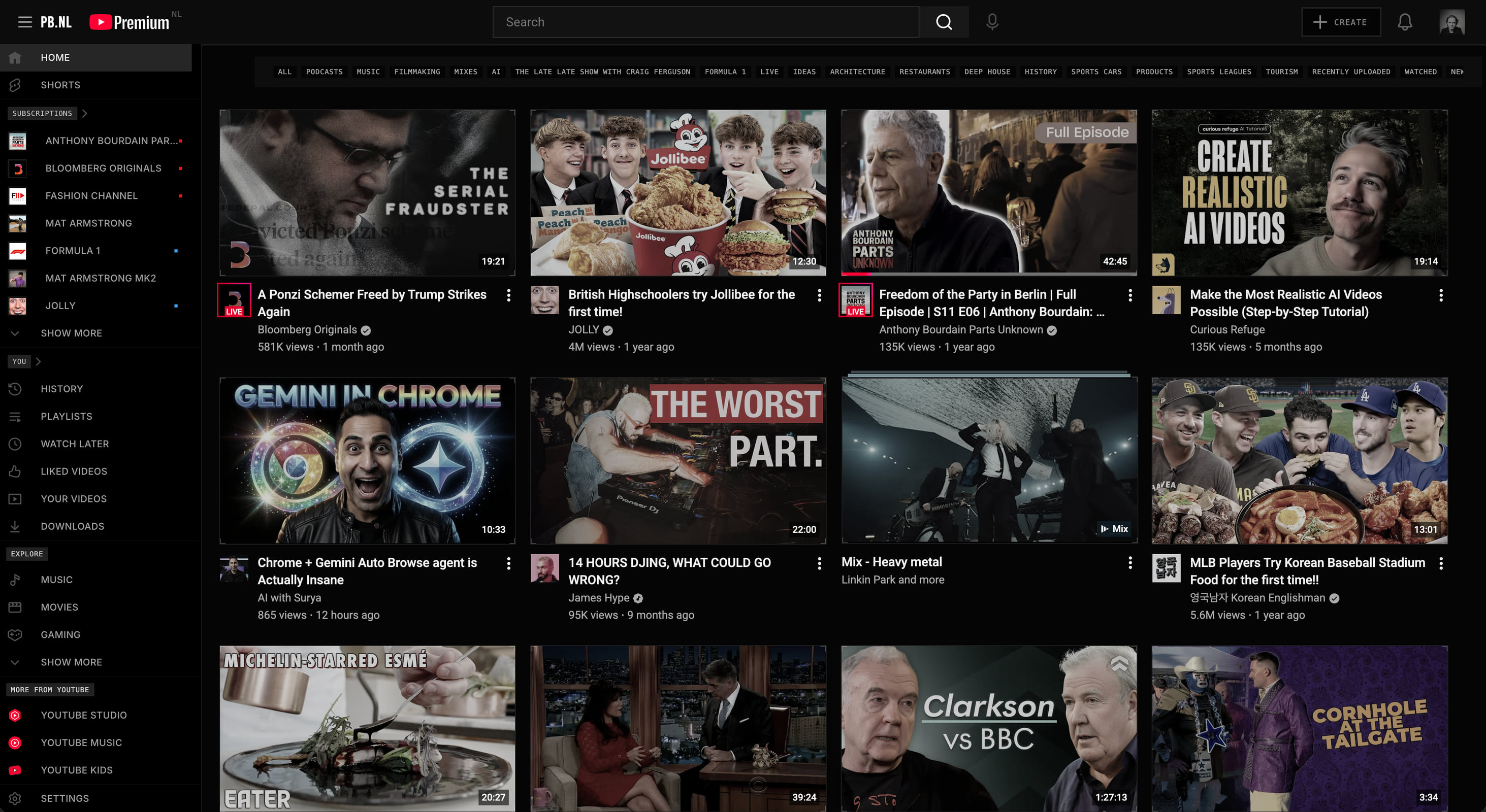
YouTube Restyled is a Chrome extension that visually and functionally brings YouTube back to its core.
No frills. No distractions.
Visually:
Dark, calm base with a subtle tech-like grid
Thumbnails initially in black and white, colour only on hover
Sleek, angular accents (no rounded corners)
Monospace typography for metadata and time
Everything feels more “terminal” than “television”
Functionally:
Channel names directly visible on thumbnails
Shorts completely removed
More compact, logical sidebar
Subtle PB.NL branding in the header
You see at a glance what something is — and whether you want to watch it.
How We Built It
The entire project emerged in one session, with Claude as a pair-programming partner.
From idea to Chrome Web Store-ready in a few hours.
Step by step:
Basic dark theme
Channel labels on thumbnails
Filter pills aligned with those labels (this was fiddly)
Styling sidebar headers
Visually delineating the mini-player
Integrating PB.NL logo
Quick iteration, immediate visualisation, adjustment, continuation.
Challenges
YouTube’s CSS is… robust.
Very specific selectors, lots of !important, little cooperation.
Our solution: be even more specific.
And where necessary, use JavaScript setProperty() with important. Not elegant, but effective.
The filter pills were the most stubborn: nested elements each with their own minimal heights. Ultimately, we had to target each child element individually to get it neat.
The Result
YouTube, but calm.
Focused. And visually in line with how we view interfaces.
As if it comes from a sci-fi film, but functional.
The extension is ready for publication in the Chrome Web Store (once Google has verified us 😅).
Want to test it?
Let us know — or keep an eye on the Chrome Web Store.
Tags: Chrome extension, YouTube, interface design, CSS, JavaScript, PB style