The Beginning: One Experience, Everywhere
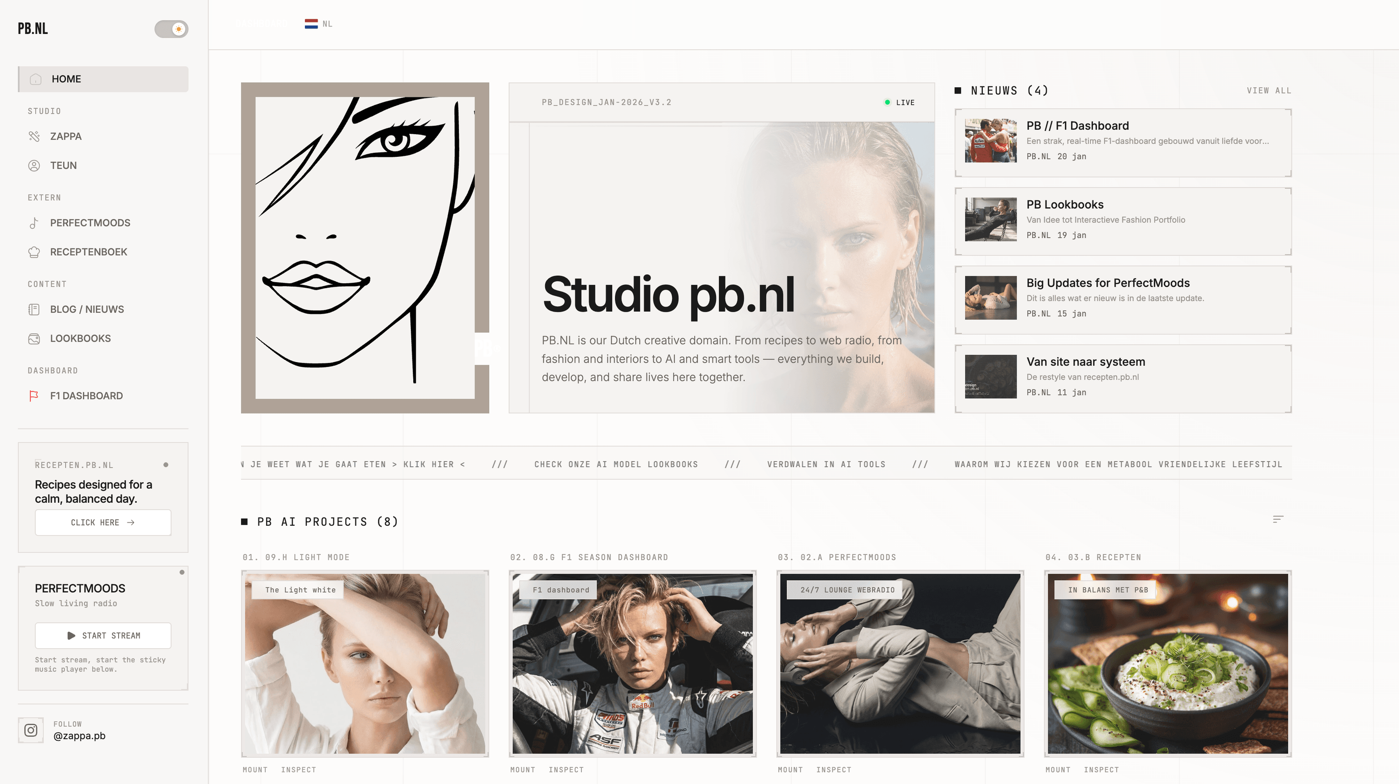
Over the past two days, we (Replit and I) have worked in short bursts on something significant: a complete site-wide light/dark mode system for PB.nl.
Not just a simple switch that flips colours, but a thoughtfully crafted foundation that feels and functions the same everywhere — from the homepage to the F1 dashboard and lookbooks.
What We Have Achieved
One Theme, Remembered Everywhere
Whichever page you visit, your preference is retained. One choice, one experience — consistent throughout the entire site.
A Calm, Fixed Toggle
The light/dark toggle is now a compact slider with sun and moon icons. Always in the same place, on both desktop and mobile. No searching, no noise.
Lookbooks with Their Own Character
Lookbooks can have their own default atmosphere without restricting the user. The balance between editorial choice and personal preference remains intact.
The Homepage Rebuilt
The homepage now fully breathes with the chosen theme:
warm off-white tones in light mode
deep, calm black in dark mode
subtle gradients on images
a light, airy TEUN carousel
illustrations that switch automatically
Everything feels cohesive, nothing forced.
A New Footer
Sleeker, more functional, and calmer:
form and newsletter logically side by side
sharp corners, no round distractions
fully aligned with both modes
News at PB Pace
The NEWS block now visually aligns with the F1 style: compact, clear, with distinct accents and a focus on content.
The Colour Palette
Dark Mode (Default)
Background: deep black
Surfaces: slightly lighter
Text: bright white
Lines: subtle, restrained
Light Mode
Background: warm off-white
Surfaces: soft beige
Text: dark, almost brown
Lines: light and calm
No harsh contrasts, yet tension.
Under the Hood
The system is technically solid but feels light and intuitive. Everything is built to grow: new sections automatically integrate without extra work.
And Now Onwards
This is not an endpoint, but a foundation. As you know, I often rebuild :)
The design language — sharp corners, calm typography, clear choices — now runs throughout the entire site. PB feels like a unified whole again.
Exactly as it should be.
Peter.