
Built tonight. I handled the ideas, the direction, the reviews, the git pulls, the publishes, and the verification to ensure everything aligns with my vision. Claude managed the code. Together, we are formidable :)
Three New Pages, One Evening
It started with: "could you also see the points progression per race?" And suddenly, there was a head-to-head comparison for teammates. Then I wanted to know the weather forecast for Suzuka.
That's how dashboards grow.
Championship Progression shows how the championship develops race by race. Line graphs. Interactive. Driver standings and constructors' standings. 2025 or 2026, your choice.
Head-to-Head Battles compares teammates. Who wins the qualifications within a team? Who scores more points? All 11 teams, official team colours, neatly laid out. Max vs Liam is a bit sad here, though.
Circuit Weather might be the most fun. A live weather forecast for each circuit for the entire race weekend. Friday, Saturday, Sunday. Per session. FP1 to Race. 24 circuits, GPS coordinates all hardcoded in the codebase, because that's how it goes.
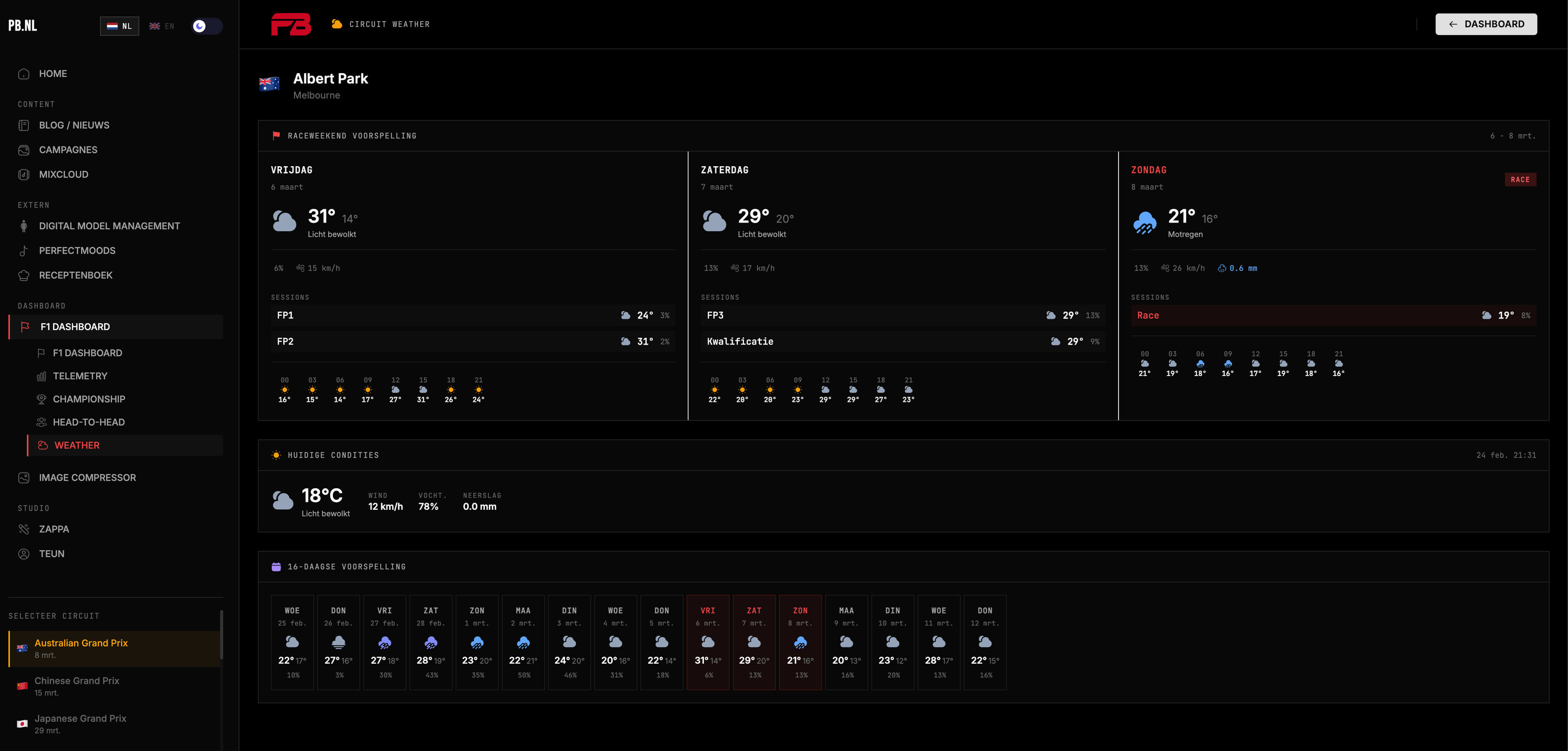
And coincidentally, the season starts in a few weeks in Melbourne. Australia. Albert Park. First race of 2026.
The dashboard already knows the time.
Demo Mode
Through our F1 CMS, you can simulate a live race with a single click. The Demo Mode activates a full Australian Grand Prix on lap 42 — complete with Live Tower (positions and gaps), Race Control Feed (flags, pit stops, penalties), and Tyre Strategy Timeline (tyre changes per driver). Ideal for testing the live experience without waiting for an actual race. The toggle is off by default and resets automatically with each deploy. And I've set everything up neatly, so be sure to check during a race at pb.nl for all live information directly on our dashboard.
Meanwhile in Higgsfield
While Claude was building, I was busy with something else in Higgsfield.
Our DMM models — yes, those digital ladies — also did some F1 tonight. Created new banners for the dashboard. Pit lane vibes, team colours, editorial. The kind of imagery you wouldn't think of for an F1 dashboard, but it fits perfectly.
And then some colour and design tweaks around it. Since the dashboard now has more pages, it deserved a sleeker look.
Two things at once. Building and styling. That's how efficient we are here. #keepgoing
Data from Everywhere, Free
Weather fetched via Open-Meteo. No API key, no costs, it just works. Race data via Jolpica — the open-source successor to Ergast. Live session data via OpenF1.
Three APIs. One dashboard. Server-side caching so we don't bother them every time.
And the Homepage
Race Weekend Weather is now also on the homepage. Compact block, right under the calendar. What's the weather for the next race? For Australia: take a look.
All 11 team logos are now official. It just looks better. Four feature banners in a 2x2 grid for the new pages.
Stack (for Completeness)
React + TypeScript, TanStack Query, Recharts, Tailwind, Iconify icons. And three APIs that fortunately don't get upset if you call them every six hours.
The dashboard is at pb.nl/f1. Peet.